Product Shot
March 29, 2007
The task was to research advertising product shots (from the Internet and from magazines) and then produce a series of images in the studio. The product shots should have personality and narrative.
The product I chose was a small perfume bottle. First I thaught the images, the message and story should be humorous and a bit rough. After the first time in the studio, I understood however that sensual was the way to go.
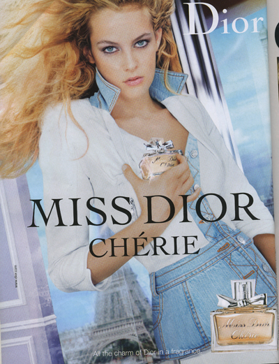
After years of flipping through womens magazines the perfume ads have formed a distinct picture in my mind. There’s a beautiful woman and a bottle. The bottle usually is placed in the foreground and the women are presented in a sexual and seductive manner.
I have this tiny perfume bottle, that is actually about three centimeters tall. The perfume itself doesn’t smell especially good, but I think the bottle is very charming. The perfume is called Mitsouko and it is a fragrance by Guerlain. I visited a couple of sites on the Internet to find out what Mitsouko really means. Mitsouko is apparently Japanese and stands for mistery. The fragrance was created in 1919 and is described as rich and elegant without beeing too heavy, and also as “unique, cloaked in a sensuos air”.
I wanted to create a sense of mistery in the pictures. It was important that the mood remained sensual and suttle. I made the background of the images blurry and cropped them so that they would be more insinuating and sensuous rather than graphic and tacky. The pictures should be inviting to solve the titillating mystery of the model. By using the perfume you will become enchanting. You can express your inner mystery and your secret desires in a suttle fashion.
For all my images I had to take to shots. First time around in the studio, I took the photos with the models and the bottle together. I did not use the flashes, I used them as regular lights instead. The photos had a lot of noise in them partially because of this, I think. The bottle was so small and usharp in the photos, that it was useless. The soft blurryness of the background was exactly what I wanted though. I decided to shoot the bottle separately to get it sharp and as big as I wanted in proportion to the model and the background.
When photographing the models I had four lights, the flashes without flash. Two of them standing tall on the sides and directed downwords. Two lights at a lower height from the front. I took the photos against the dark background and had a table covered with dark paper and fabric. The model was leaning on the table or sitting behind it.
When shooting the bottle, I had two flashes lighting the bottle from both left side and right side. I wanted for the object to be sharp and that you would see colour of the liquid inside. Naturally the colour of the liquid depends on the colour of the background, so I needed for the colour to be dark enough, so that it would match with the background in the different pictures.
I took a lot of pictures with different lightings of the bottle, and then I chose the picture I’ve posted at the bottom of this post, where you can see the originals. In Photoshop, I then took down the exposure very slightly and added some saturation and reduced “the hue”. This I did with only a couple of margins. I used the Quick Mask mode to cut out the bottle from its background. Then when I had the bottle on a layer of its own I resized it according to the new background.

I might have cropped this image just a bit from the left, It doesn’t really show. I reduced the noise and then made the black colour of the blouse continue all the way down to the edge of the image with clone stamp tool. I drew a logo based on the logo on the bottle. I added the the text and merged it with the logo, the colour of the text and logo I took from the bottle lable. I came up with “the slogan” based on my earlier research.

To this picture I made very similar adjustements as to the previous. I reduced the noise and used the Quick Mask to separate the foreground from the model. This so that I could turn down the exposure in the foreground and make it darker and more black rather than brown. I added the word “within” to the slogan, refering to the mystery within the girl, yourself and the bottle. I ike this and the following piture in particular, these images are stronger than the other two. The composition and cropping stress out the theme, and they are clearly part of a series.

This is probably my favorite image of the four. Here, as in the previous two, I reduced the noise. Then I used Clone Stamp Tool to get the black colour in the background to continue down to the foreground. I like the fact that it is not completely obvious that you are looking at two women. The person to the left could be a young boy, but still its quite clear. Even so, you can play with the thought and part of the mystery becomes, are you looking at to women or what is actually happening?

With this image the biggest difficulty was to figure out a good composition, since the format was so different. I wanted to use this photo of Ilona, because her expression is so intense. She is looking strait at the spectator and the expression is sensual and inviting, still suttle. The arm looks a bit funny, maybe I should have cropped it out, her jaw is also missin ga part because the fabric on the table gets in the way. This image is not as clearly a part of the series as the previous three, but beeing the last image it is the one that reveals the most. I made the foreground darker with Clone Stamp Tool, and I used the same tool to “cut” out the bottle in the original picture.
Research And Influence

My research material is compiled from womens magazines Trendi, Marie Claire and New Woman. On the Internet, the perfume ads and product shots can be slightly different. There the image format is not necessarily traditional billboard or magazine, because the way of presenting the image is not limited to portrait or landscape format. Below the list of images I have posted a couple of web addresses to pages with perfume ads. If you look at the magazine ads you can see that the bottle is often brought to the foreground, usually you can see that it is shot separately and it is often placed in one the lower corners of the page.


http://www.polo.com/shop/index.jsp?categoryId=2108364&cp=1760786&SMR=1
http://www.dior.com/pcd/International/JSP/Library/Full/fullf_L2.jsp?pTPL=1003&pLANG=enall
http://www.dior.com/pcd/International/JSP/Library/Full/full_L3.jsp?RUB=0&CAT=86
http://www.kenzoparfums.com/FR/home/home_FR.html
The Originals


Heini:
Shutter Speed: 1/80
Aperture: 4.8
ISO 1000
Focal Length 48.0 mm
Ilona:
Shutter Speed: 1/80
Aperture: 4.8
ISO 1000
Focal Length 48.0 mm


Etumus:
Shutter Speed: 1/80
Aperture: 5.6
ISO 1000
Focal Length 80.0 mm
Ilona&Heini:
Shutter Speed: 1/80
Aperture: 6.3
ISO 1000
Focal Length 80.0 mm

Mitsouko:
Shutter Speed: 1/100
Aperture: 8
ISO 100
Focal Length 135.0 mm
