Album Cover
March 29, 2007
The task was to produce a series of images to be used as album cover art for an imaginary band called Abstinent Obsession. Part of the task was to represent the bands identity and the chosen genre of music in the images. Also for this task we students had to produce three square images (front and back cover – with spin details – plus inlay booklet back cover) and one landscape format image (inlay booklet interior).
I wanted the images to have an authentic feel and avoid too much photoshop treatment. I thought the music would sound like something of Massive Attack, Sigur Roos and Jan Garbarek. Something nordic, cold and still but sometimes threatening and intense. I thought ice, the sea, cloudy skies, steel and concrete would communicate this landscape of sounds and make it visible.

Front Cover
I cropped this image and enhanced the exposure on the name of the boat. Arctica became the name of the album, it was perfect for the music I imagined in my head. I added the text with the text tool to a separate layer. It was quite challenging to find a suitable font. It had to be similar to the typing on the boat.

Inlay Booklet Interior
I cropped this image in order to achieve the right format and proportions.

Inlay Booklet Back Cover
This image received the most photoshop treatment. Naturally I cropped it, but then I separated the skyline with the Quick Mask. Then I lowered the exposure of that area to get a darker more menacing sky, like one preceding a storm. I did not want to overdo it though, so I reduced the opacity of that layer.

Back Cover with Spin Details
This is the less serial of all the images. I like the way the building looks and the colour and feeling of steel against the cloudy sky. I cropped the photo and then used the grey from it to the surrounding “background”.
Research And Inspiration


The Originals Nikon D70


Laiva:
Shutter Speed: 1/125
Aperture: 11
ISO 200
Focal Length 60.0 mm
Meri:
Shutter Speed: 1/125
Aperture: 9
ISO 200
Focal Length 18.0 mm


Tornit:
Shutter Speed: 1/125
Aperture: 7.1
ISO 200
Focal Length 18.0 mm
Nosturi:
Shutter Speed: 1/125
Aperture: 9
ISO 200
Focal Length 18.0 mm
Product Shot
March 29, 2007
The task was to research advertising product shots (from the Internet and from magazines) and then produce a series of images in the studio. The product shots should have personality and narrative.
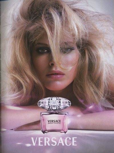
The product I chose was a small perfume bottle. First I thaught the images, the message and story should be humorous and a bit rough. After the first time in the studio, I understood however that sensual was the way to go.
After years of flipping through womens magazines the perfume ads have formed a distinct picture in my mind. There’s a beautiful woman and a bottle. The bottle usually is placed in the foreground and the women are presented in a sexual and seductive manner.
I have this tiny perfume bottle, that is actually about three centimeters tall. The perfume itself doesn’t smell especially good, but I think the bottle is very charming. The perfume is called Mitsouko and it is a fragrance by Guerlain. I visited a couple of sites on the Internet to find out what Mitsouko really means. Mitsouko is apparently Japanese and stands for mistery. The fragrance was created in 1919 and is described as rich and elegant without beeing too heavy, and also as “unique, cloaked in a sensuos air”.
I wanted to create a sense of mistery in the pictures. It was important that the mood remained sensual and suttle. I made the background of the images blurry and cropped them so that they would be more insinuating and sensuous rather than graphic and tacky. The pictures should be inviting to solve the titillating mystery of the model. By using the perfume you will become enchanting. You can express your inner mystery and your secret desires in a suttle fashion.
For all my images I had to take to shots. First time around in the studio, I took the photos with the models and the bottle together. I did not use the flashes, I used them as regular lights instead. The photos had a lot of noise in them partially because of this, I think. The bottle was so small and usharp in the photos, that it was useless. The soft blurryness of the background was exactly what I wanted though. I decided to shoot the bottle separately to get it sharp and as big as I wanted in proportion to the model and the background.
When photographing the models I had four lights, the flashes without flash. Two of them standing tall on the sides and directed downwords. Two lights at a lower height from the front. I took the photos against the dark background and had a table covered with dark paper and fabric. The model was leaning on the table or sitting behind it.
When shooting the bottle, I had two flashes lighting the bottle from both left side and right side. I wanted for the object to be sharp and that you would see colour of the liquid inside. Naturally the colour of the liquid depends on the colour of the background, so I needed for the colour to be dark enough, so that it would match with the background in the different pictures.
I took a lot of pictures with different lightings of the bottle, and then I chose the picture I’ve posted at the bottom of this post, where you can see the originals. In Photoshop, I then took down the exposure very slightly and added some saturation and reduced “the hue”. This I did with only a couple of margins. I used the Quick Mask mode to cut out the bottle from its background. Then when I had the bottle on a layer of its own I resized it according to the new background.

I might have cropped this image just a bit from the left, It doesn’t really show. I reduced the noise and then made the black colour of the blouse continue all the way down to the edge of the image with clone stamp tool. I drew a logo based on the logo on the bottle. I added the the text and merged it with the logo, the colour of the text and logo I took from the bottle lable. I came up with “the slogan” based on my earlier research.

To this picture I made very similar adjustements as to the previous. I reduced the noise and used the Quick Mask to separate the foreground from the model. This so that I could turn down the exposure in the foreground and make it darker and more black rather than brown. I added the word “within” to the slogan, refering to the mystery within the girl, yourself and the bottle. I ike this and the following piture in particular, these images are stronger than the other two. The composition and cropping stress out the theme, and they are clearly part of a series.

This is probably my favorite image of the four. Here, as in the previous two, I reduced the noise. Then I used Clone Stamp Tool to get the black colour in the background to continue down to the foreground. I like the fact that it is not completely obvious that you are looking at two women. The person to the left could be a young boy, but still its quite clear. Even so, you can play with the thought and part of the mystery becomes, are you looking at to women or what is actually happening?

With this image the biggest difficulty was to figure out a good composition, since the format was so different. I wanted to use this photo of Ilona, because her expression is so intense. She is looking strait at the spectator and the expression is sensual and inviting, still suttle. The arm looks a bit funny, maybe I should have cropped it out, her jaw is also missin ga part because the fabric on the table gets in the way. This image is not as clearly a part of the series as the previous three, but beeing the last image it is the one that reveals the most. I made the foreground darker with Clone Stamp Tool, and I used the same tool to “cut” out the bottle in the original picture.
Research And Influence
My research material is compiled from womens magazines Trendi, Marie Claire and New Woman. On the Internet, the perfume ads and product shots can be slightly different. There the image format is not necessarily traditional billboard or magazine, because the way of presenting the image is not limited to portrait or landscape format. Below the list of images I have posted a couple of web addresses to pages with perfume ads. If you look at the magazine ads you can see that the bottle is often brought to the foreground, usually you can see that it is shot separately and it is often placed in one the lower corners of the page.


http://www.polo.com/shop/index.jsp?categoryId=2108364&cp=1760786&SMR=1
http://www.dior.com/pcd/International/JSP/Library/Full/fullf_L2.jsp?pTPL=1003&pLANG=enall
http://www.dior.com/pcd/International/JSP/Library/Full/full_L3.jsp?RUB=0&CAT=86
http://www.kenzoparfums.com/FR/home/home_FR.html
The Originals


Heini:
Shutter Speed: 1/80
Aperture: 4.8
ISO 1000
Focal Length 48.0 mm
Ilona:
Shutter Speed: 1/80
Aperture: 4.8
ISO 1000
Focal Length 48.0 mm


Etumus:
Shutter Speed: 1/80
Aperture: 5.6
ISO 1000
Focal Length 80.0 mm
Ilona&Heini:
Shutter Speed: 1/80
Aperture: 6.3
ISO 1000
Focal Length 80.0 mm

Mitsouko:
Shutter Speed: 1/100
Aperture: 8
ISO 100
Focal Length 135.0 mm
Versus Callahan – Recreating a portrait
March 1, 2007

Ilona as Eleanor
This is my shot at recreating Callahans Eleanor. And below You have the picture taken by Callahan in 1947.

The photograph is over exposed and the lighting very flat. It looks almost as if the womans body would continue endlessly. First I had my model, Ilona, sitting on a chair against a white background. The pose was very uncomfortable for her, and the result looked anything but relaxed. Next time we were in the studio we decided she should lie on the floor instead, wich was a great idea. We could have thought of it sooner, I know.
So she was lying on her back against the white backgorund, with a scarf as a pillow to lift her head up slightly. Now she could get her arms around her head without looking unnatural. I had one spot – with an umbrella to soften the light – pointing at Ilona from the left, then another spot from down to the right, plus a white cardboard above/behind Ilonas head to reflect the light from the spots.
The technicalities:
Model: Nikon D70s
Shutter Speed: 1/1250 sec
Aperture Value: 5.0
ISO: 400
Focal Lenght: 60.0 mm (or 90.0 mm??)
Metering Mode: Spot
Below is the original picture without any photoshop treatmeant.

So first I changed the picture to black and white with changing the “saturation”. Then I selected everything but the right side of the nose and over exposed the lighting with “Exposure”, after which I selected the nose and over exposed it separately so that I could get the shadow to remain almost the same as in the unhandled picture. I also cropped the picture to get the face a bit more centered, cut the sharp elbows out and the tip of one finger.
I used “Clone Stamp Tool” to remove shadows and traces of Ilonas back arm and the border of her top. Then I selected the tips of her fingers and used “exposure” to brighten them so that the shadows around would become thin lines. I could have used the “Dodge Tool” for example to make the arm pits white as in the picture of Eleanor, but when I tried that it resulted in a very unnatural feel. The greys in the picture were slightly blue so I changed the “Hue” from “Hue/Saturation” to get a more yellow feel.
It would have been easier to recreate the picture of Eleanor if Ilona would have been fatter. Now You get this empty area between the arms and the cheeks. The problem with “photoshopping” this was the same as the above. Eleanor also has more “flesh” on the neck under the chin in comparison to Ilona. In Callahans picture the part under the chin is almost burnt through, although You can still see the shape of the chin, In my picture You can see the chin line more clearly.
I want to add this one photo of Ilona, although I didn’t use it for the rectreating task. I like the picture a lot even if the shadow from Ilonas chin and arm is larger and darker than it should be.

Camera Controls Nikon D70s
February 22, 2007

1.1 Shallow Depth of Field
Shutter Speed: 0.3 sec
Exposure Program: Manual
Aperture Value: f/4.5
ISO Speed Ratings: 200
Focal Length: 56.0 mm/84.0 mm
Lens: 18.0-70.0 mm /27.0-105.0 mm
Metering Mode: Spot

1.2 Long Depth of Field
Shutter Speed: 10.0 sec
Exposure Program: Manual
Aperture Value: f/29
ISO Speed Ratings: 200
Focal Length: 56.0 mm /84.0 mm
Lens: 18.0-70.0 mm /27.0-105.0 mm
Metering Mode: Spot

2.1 Long Focal length
(Telephoto – Compression of perspective)
Shutter Speed: 0.4 sec
Exposure Program: Manual
Aperture Value: f/6.3
ISO Speed Ratings: 200
Focal Length: 70.0 mm /105.0 mm
Lens: 18.0-70.0 mm /27.0-105.0 mm
Metering Mode: Spot

2.2 Short Focal Length
(Wide angle – Elongation of Perspective)
Shutter Speed: 1/5 sec
Exposure Program: Manual
Aperture Value: f/3.5
ISO Speed Ratings: 200
Focal Length: 18.0 mm /27.0 mm
Lens: 18.0-70.0 mm /27.0-105.0 mm
Metering Mode: Spot

3. A Sad Creation of My Own
Shutter Speed: 1/200 sec
Exposure Program: Manual
Aperture Value: f/5.0
ISO Speed Ratings: 200
Focal Length: 18.0 mm /27.0 mm
Lens: 18.0-70.0 mm /27.0-105.0 mm
Metering Mode: Spot
After changing White Balance from Cloudy (as shot) to Shade in Photoshop:

Well now… I just realized that I’ve done this totally wrong, this last task I mean. The aperture and shutter speed are not as they should be, but that is because the camera went out of control. Maybe it was because of the cold, but every time I changed the shutter speed or f-value, they changed to something else in seconds. In this picture, maybe if I would have gotten a bit closer to my subject an had a larger aperture, focused on the mouth of the drain, I could have gotten that more sharp and the background diffuse. A bit more interesting than this outcome. Then of course I would have had to adjust the shutter speed accordingly, now the picture is a bit over exposed.
There lies a bigger problem here though, as You can see… You might say I misinterpreted the last task, I didn’t realize until now that You were supposed to have two subjects at a constant distance in this last picture too.
Masters of Photography
February 7, 2007
I’ve been eyeing through magazines and searching the web for portraits. The idea was to find a portrait and then try reproducing the photo in our studio later on. Of course I found tons of portraits on the internet, but it wasn’t that easy finding one that didn’t look too cheap or too commercial. I tried googelin with all kinds of words and combinations of them, but found mostly links to studios that only take ugly pictures of babies, weddings and naked women. Then I remebered this site www.masters-of-photography.com , we used this as a source for a project on Sebastiao Salgado last year. On this site I found all the photos that are attached below. I’ve tried to find portraits that it might be possible to reproduce in a studio, though I’m not sure, that they’re all taken in one. There were so many really impressive and beautiful photos that I just couldn’t choose one straight away. I think I have to sleep on it…

This piece is probably my favorite one. I thought I could try and reproduce this in the studio. The light seems so soft, still bright and natural, maybe the picture is taken with the sun shining in from a window? I like the contrast as well, the shapes and the composition, but basically I just think It is a beautiful picture. The warm, stagnant, pure feeling about it leaves my eyes at ease. I can’t really analyze it any better than that. Besides my English is so terrible, that I can’t seem to find the right words – and even if I did, I wouldn’t know how to spell them.

Harry Callahan, Eleanor, 1947
I love this picture. She lookes like she was made of milk. I’d like to know how to produce this kind of light ang contrast in a photo. I’m having trouble deciding between this and the one above.

Robert Mapplethorpe, Ajitto, 1981
Yes, the lot of it is easy on the eyes, but somewhat dull If You compare to the previous two.

Alexander Rodchenko, Portrait of Mother, 1924
What appeals to me especially is the combination of looking soft and still having something completely black in the picture, when also having something almost white burnt through… a whole scale of “gays”, and then the graininess of course. I guess most of all It’s still the motive and feeling again, that old muttering woman and the slightly sad atmosphere.

Sebastião Salgado, Refugee from Gondan, Mali 1985
